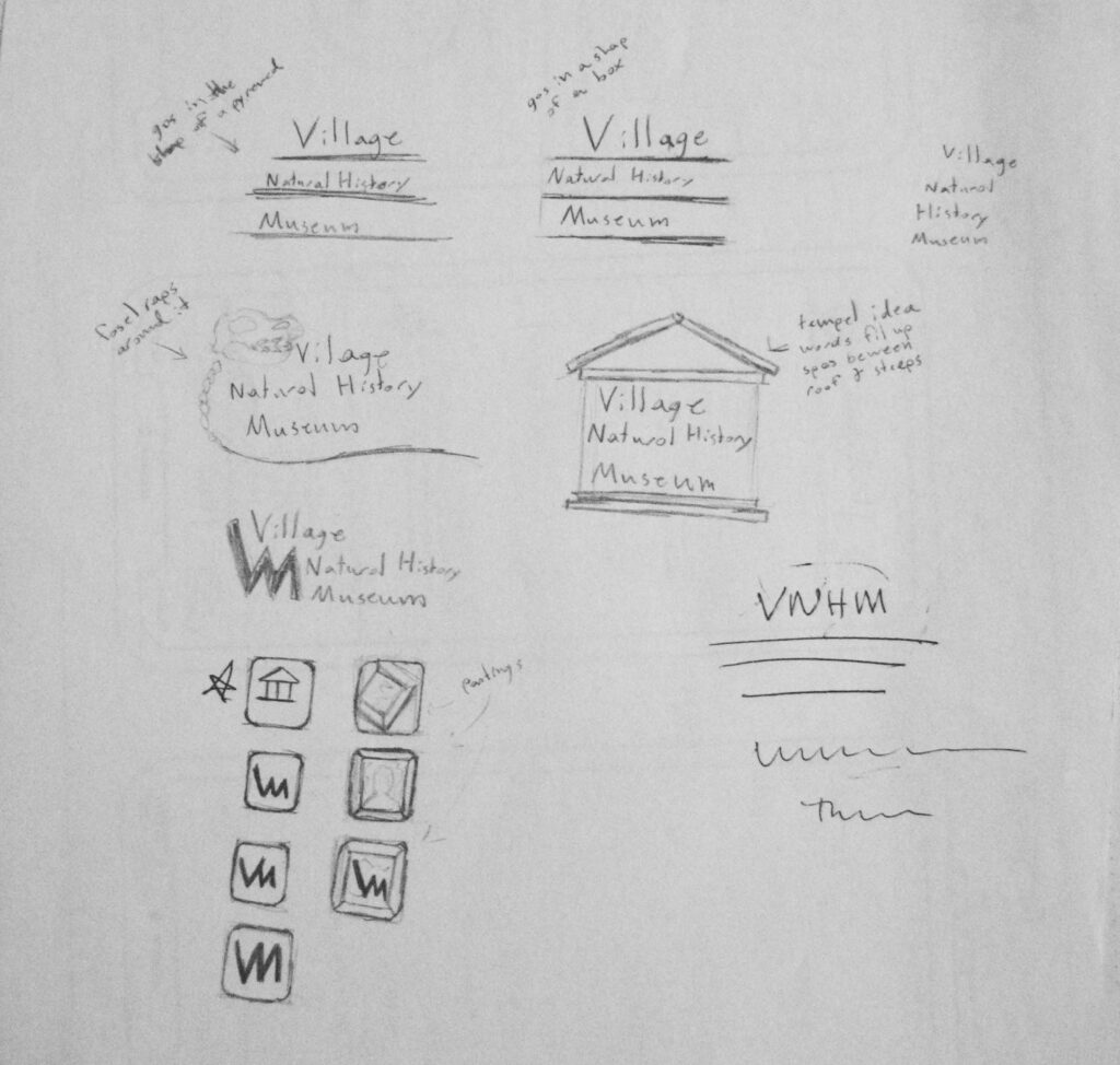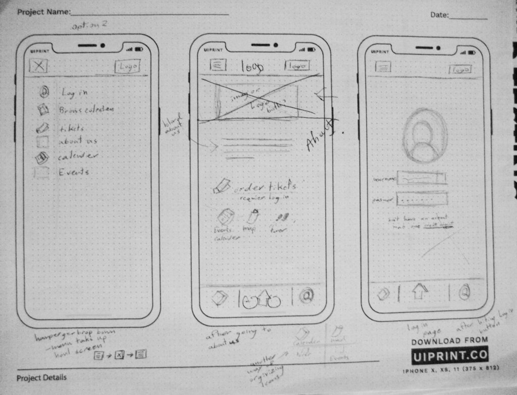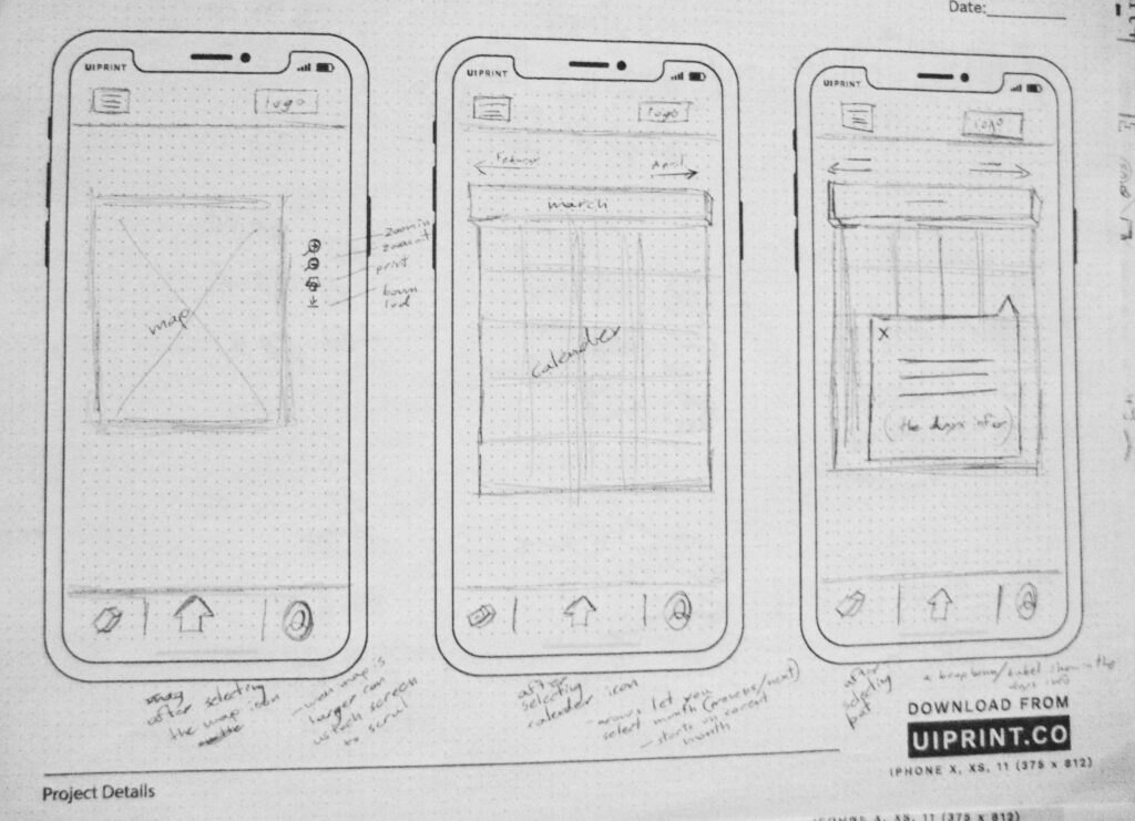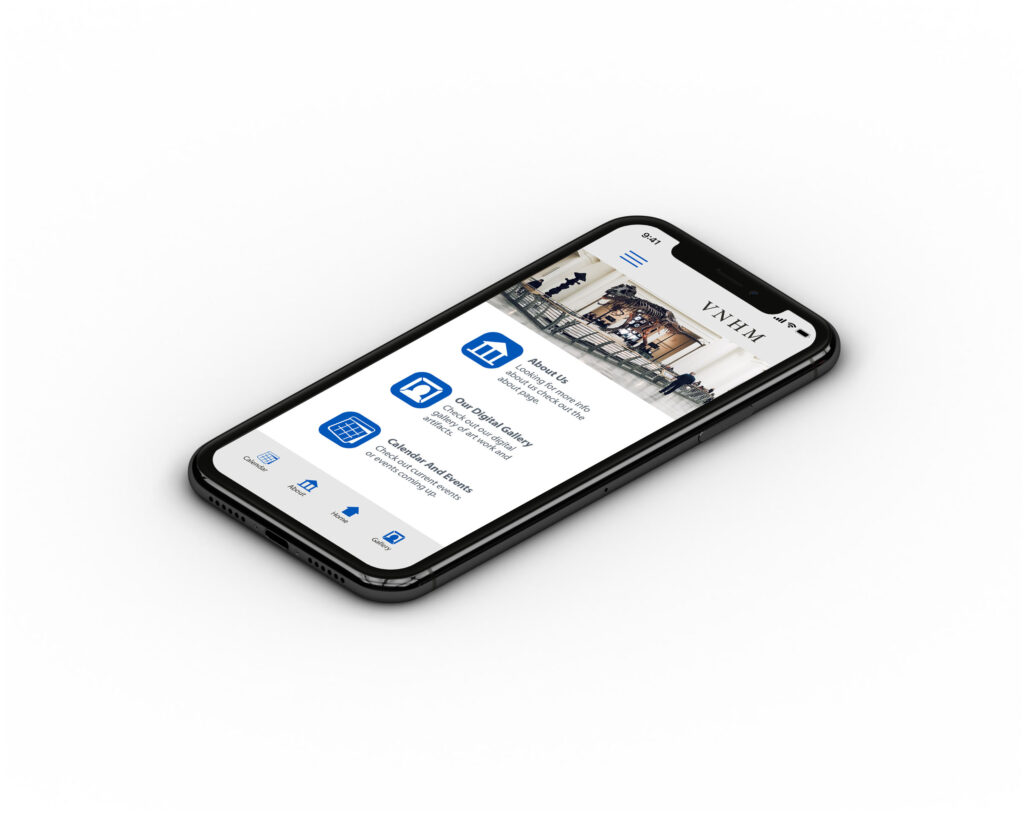
Screens for an app designed for a mock museum named Village Natural History
Museum. When designing, the focus started with the icons and then moved to the layout of the user interface. The screens are meant to show the process of finding the events calendar from the apps main menu.
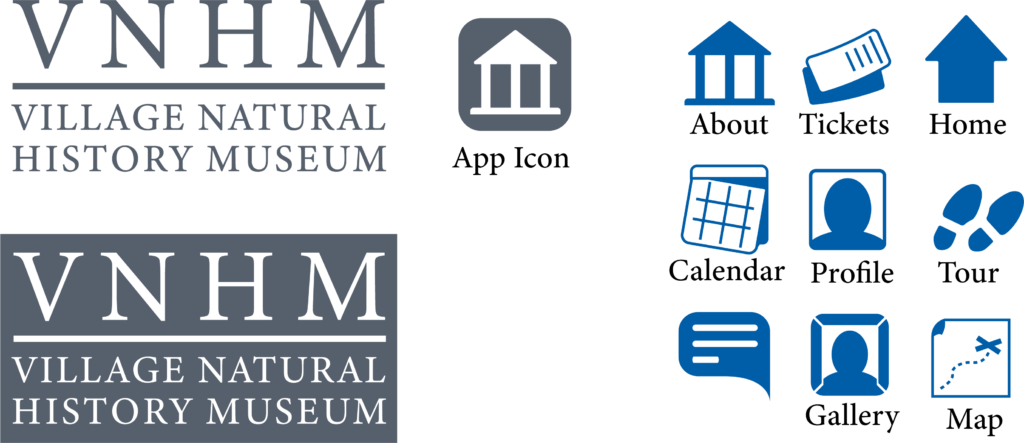
The colors used are primarily a light blue, a gray blue and light gray. These colors
contrast for the different elements to be seen and understood. It also helps give an open, airy, and, clean feel to the app that reflects the mock museum it was
designed for.
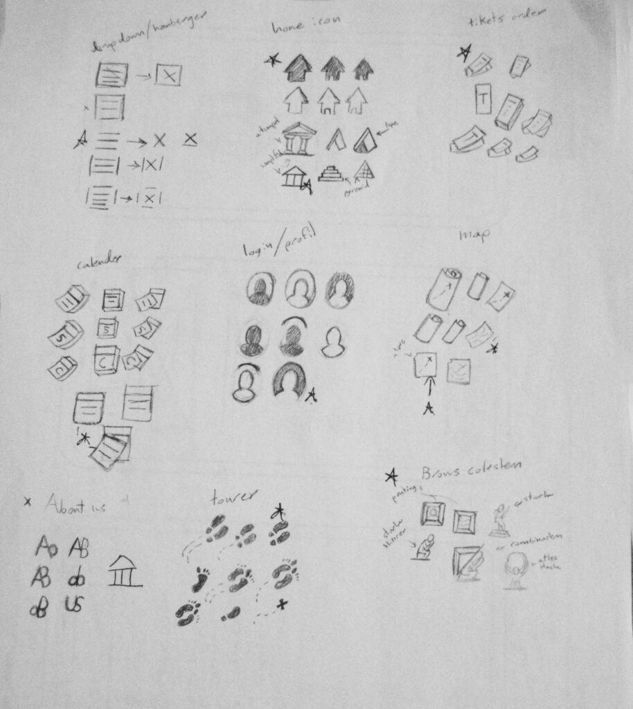
The icons in the app are set to reflect the induviduel sections of the app. Such as how the icons all have softer rounded edges to help with the open and clean feeling.

Loading Screen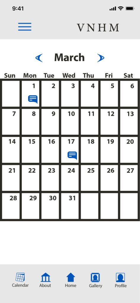
Event Calendar Screen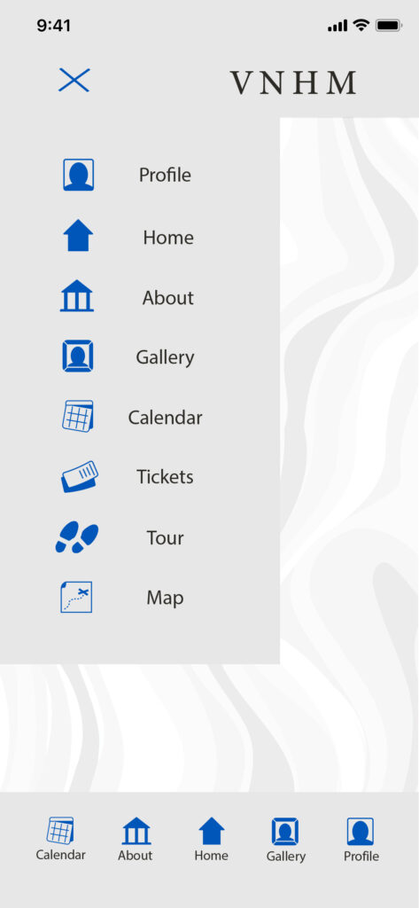
Drop Down Menu Screen
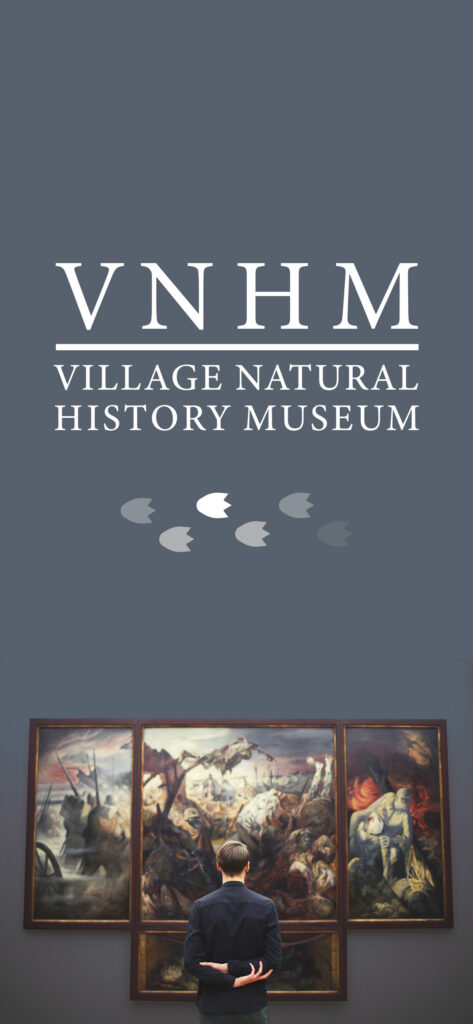
Loading Screen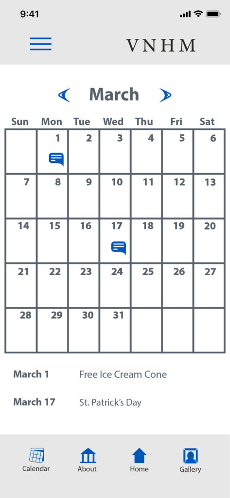
Event Calendar Screen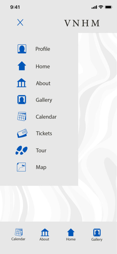
Drop Down Menu Screen

