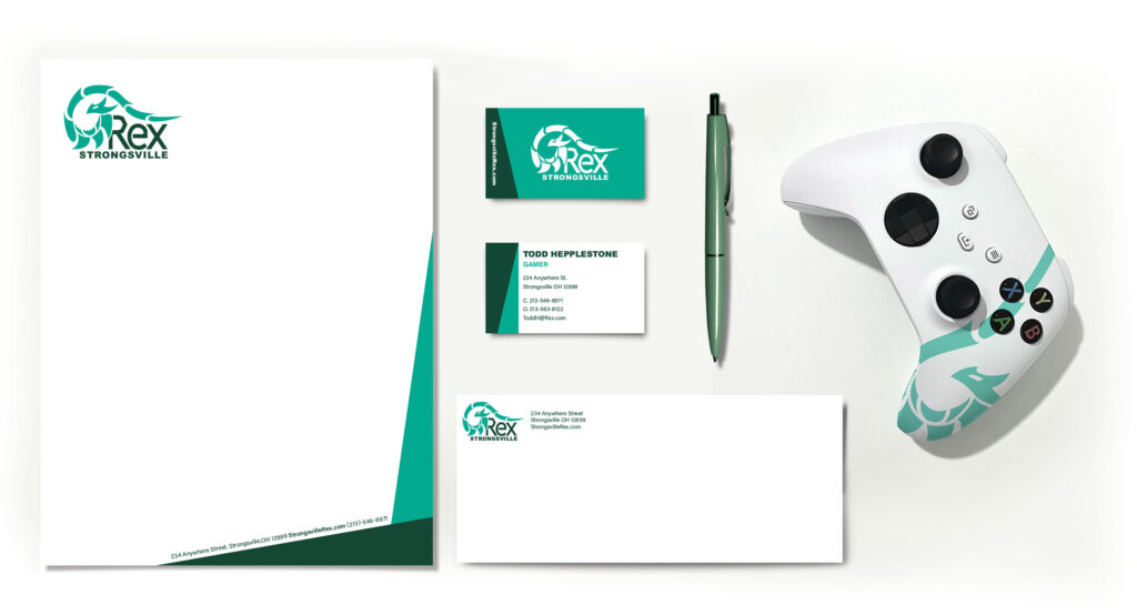
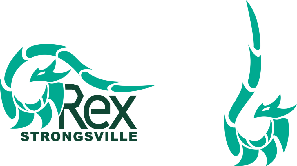
A branding and guideline book for a mock local e-sports team logo. The book contains the Rex sports logo, its variations of black and white, guidelines on spacing, colors used, the type face used and the identity system.
The colors that are used are two different greens that references the green used by the local high school team, the Strongsville Mustangs. The two shades of green are used to create contrast between the symbol and text allowing you to read both.
The logo has jagged and sharp looking edges to convey a sense of competitiveness fitting for a sports team. The main logo has the lighter green symbol wrapping around to the top of the text to better connect the two parts. The sub logo consists of the
symbol but stands up to convey a sense of readiness for competition.
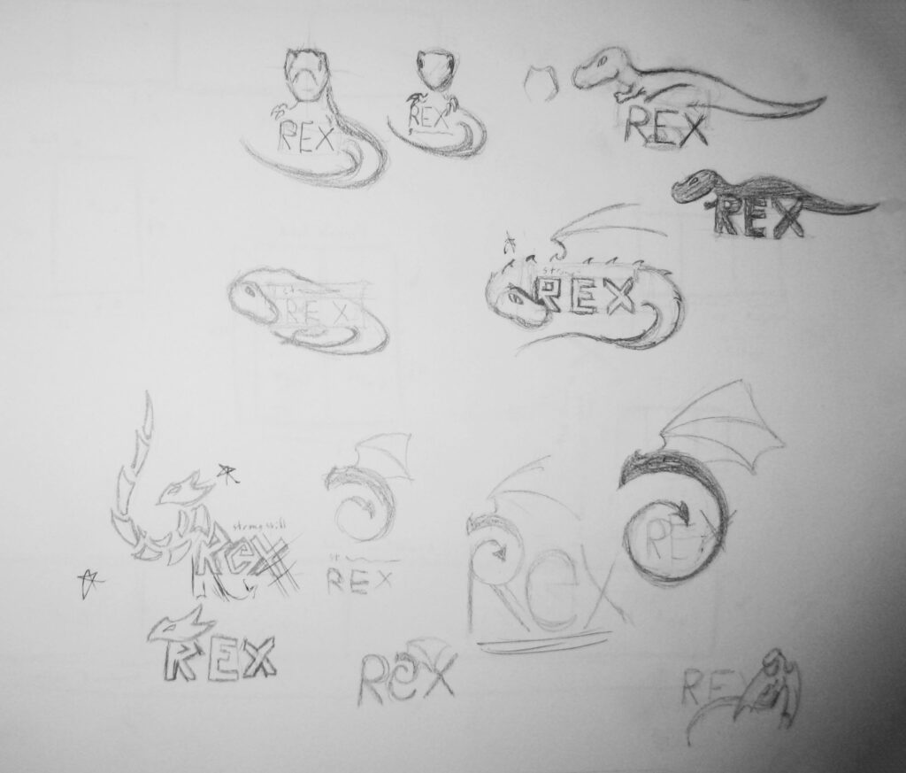
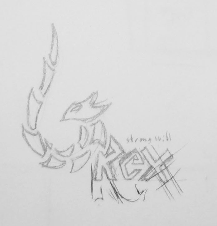
Sketches that was decided on 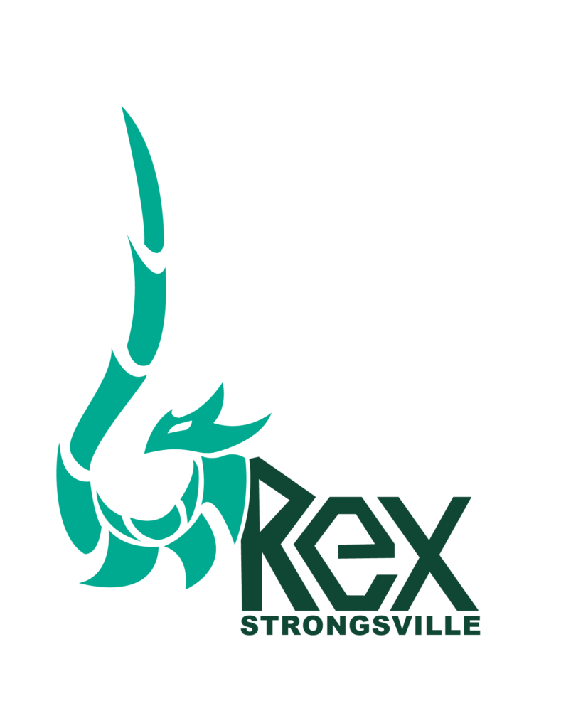
In process main Rex Logo 
In process sub Rex Logo
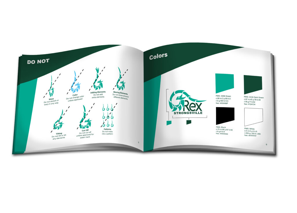
Do Not and Color Study in book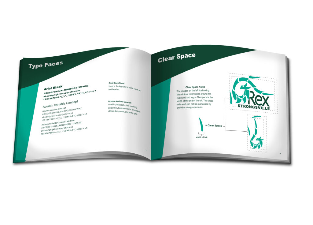
Type Face and Clear Space in book
