A brochure created for Lux Fashion Rental, a mock fashion company. The Lux
company is a local fashion rental service that looks luxurious but is affordable
for everyone.
The text was thought up and created in a group setting, and the visuals and layout was done individually. The text is similar to the Lux logo to create unity between the two. The font was also chosen for its readability on dark and light backgrounds. The font allows for bolding and changing color to create hierarchy better.
The main colors used are purple, white, and shades of gray. The purple comes from the logo and is referencing the clothing of royalty. Shades of gray are used to create a slight texture on some of the panels. The white background used on the rest of the panels are meant to contrast and break up the darker colors.
The swooping shapes come from the logo and is meant to bring an art deco feeling to the brochure. Images being used are to help give an idea of the products that could
be offered
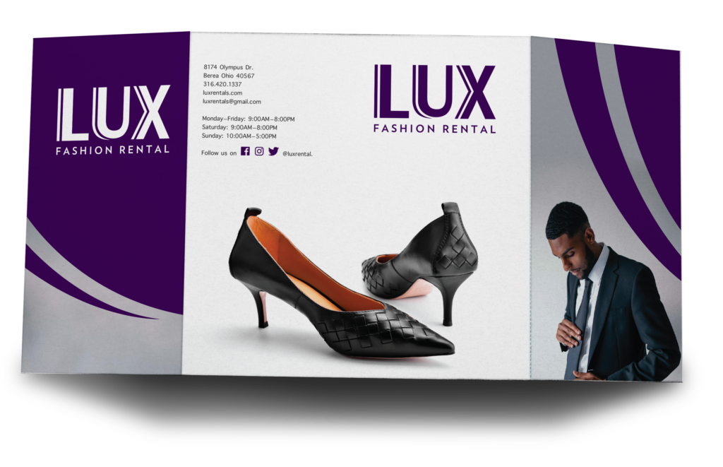
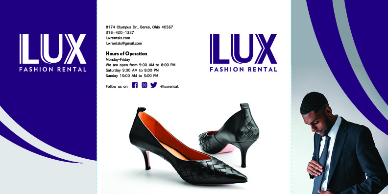
Cover and back of brochure 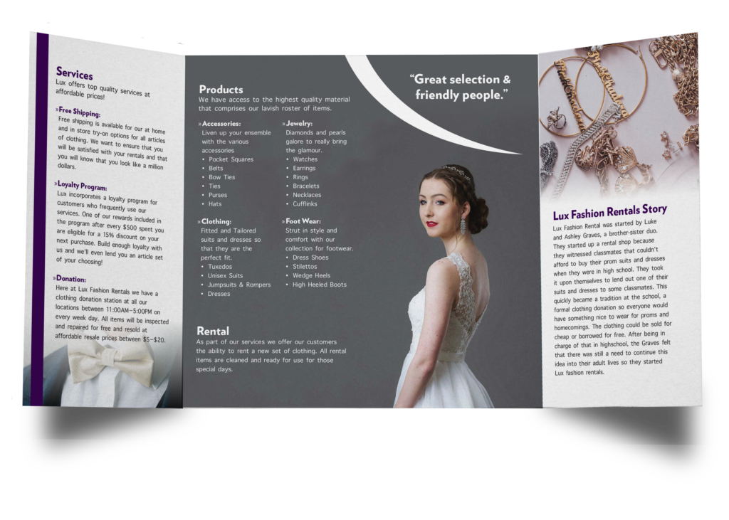
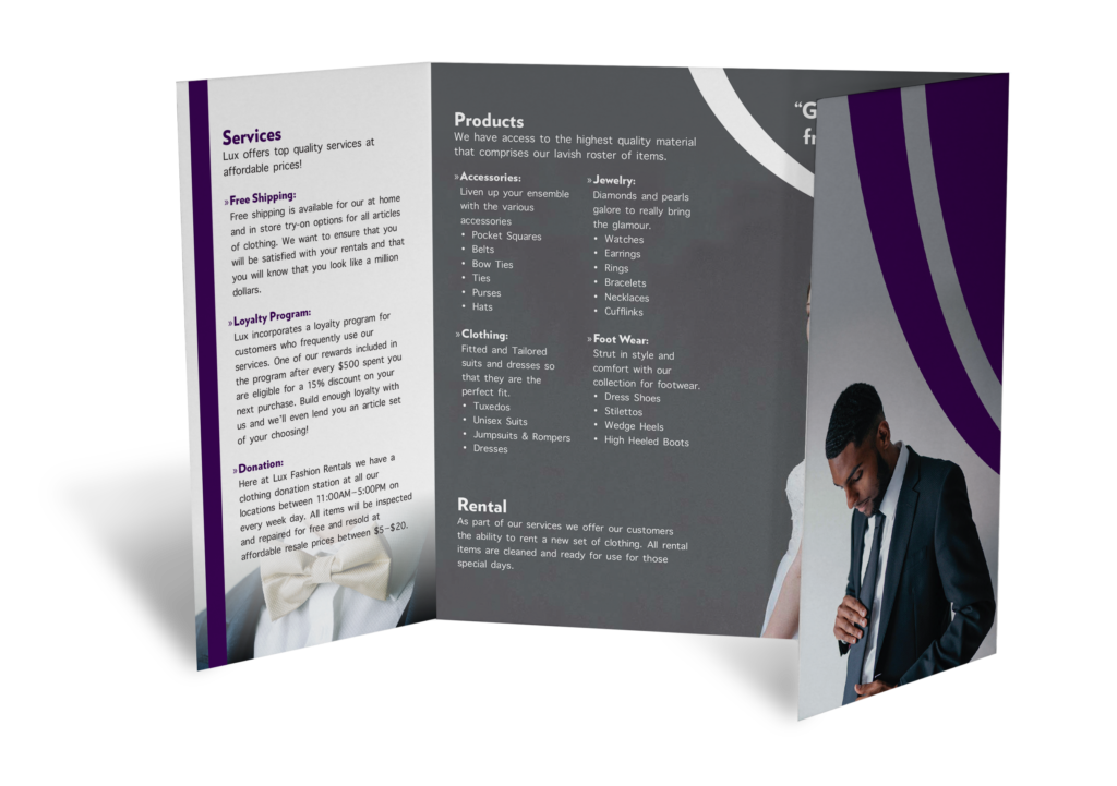
Inside of brochure

